Optimising health by design for a proactive testing company
.jpg)
Achievements
Updated web app shipped with improved customer experience and brand visuals
NPS up by 5 points
Positive increase in Trustpilot scores
Overview
I worked with the team at Thriva thriva.co as a Product Designer to transform their customer-facing web app experience. This included updating it with their new brand identity and Design System components (while adding more) and auditing, redesigning, launching and improving upgrades to each area using data, user testing and research.
I also designed new features for Thriva's native mobile app and worked on future concepts.
Below are just some of the initiatives I worked on with the Thriva team.
%20(1).jpg)
Clearer navigation and page templates
I created navigation and page templates that would match the new look and feel.
I did some data benchmarking to understand where customers were going to, ran some competitor research and audited the navigation against industry best practices. It turned out, where people were going vs where the team wanted them to go were not aligned.
I created some new ideas, we chose a direction and then I worked with the engineers to get the new navigation and page templates shipped and into the Design System.
The new navigation has had fantastic results: customers are now prioritising the pages most useful to them and the team still make improvements and tweaks based on data and feedback to ensure the navigation is regularly optimised for customers.
%20(1).jpg)
Settings and accounts pages aligned to customer goals
We looked at ways we could help customers with managing their accounts through decoupling once-in-a-while admin with regular account and subscription management and grouping related actions together.
We looked at any common customer complaints related to their account actions and technical ways we could improve this experience.
The result: pages that were better matched to customer needs and expectations.
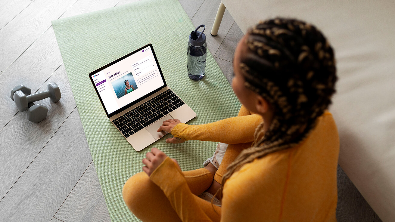
Collecting better health information
Customers are able to provide Thriva with more in-depth health data to personalise their doctor's reporting further. I designed an improved questionnaire experience to help customers to fill this out efficiently and to understand the benefits of doing so better.
%20(1).png)
Improved sample-taking instructions
Thriva had introduced a brand-new blood-sample-taking device: the Autodraw. This meant an overhall of all previous sample-taking instructions with previous devices to make everything consistent, on brand and crystal clear for customers. I did an audit of all existing instructions and proposed improvements and a style upgrades.
.jpg)
%20(1).jpg)
Clearer results and trends
Customers praised the quality of their results reports but were also looking for a way to see higher level trends, plus see a quick overview of how they were doing and the progress they were making across all blood tests.
I gave their results reports an upgrade and then created a new overview area where customers could see all their results in one go and explore and monitor their data and trends at a higher level.
%20(1).jpg)
%20(1).jpg)
The result
It was a fantastic 9 months working with the Thriva team and learning from their wonderful customers.
We managed to achieve and ship so much together and it was great to see the hard work pay off in customer reviews and NPS feedback.
"I was really happy with how easy the Thriva at home blood test was to complete. The instructions were clear, the kit was well put together, and the whole process felt very organised from start to finish."
Joe Lewis, Thriva customer
Trustpilot 5* review, Sep 2025
.jpg)

%202.png)
